
Building a dual-purpose brand identity
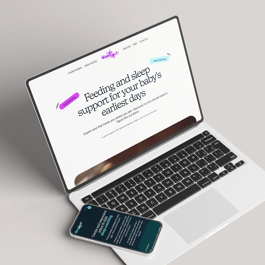


A lactation and sleep coach approached us for a new brand identity and website to support her growing practice. I led content strategy, visual design, and the Webflow build, focusing on clarity, consistency, and an experience that felt natural, authentic, and reassuring to visitors.
Because lactation and sleep coaching relies heavily on trust and long-term relationships, it was important that the brand reflected our client’s personality and values. The identity needed to feel trustworthy, empathetic, experienced, and approachable—without losing warmth or a sense of ease.
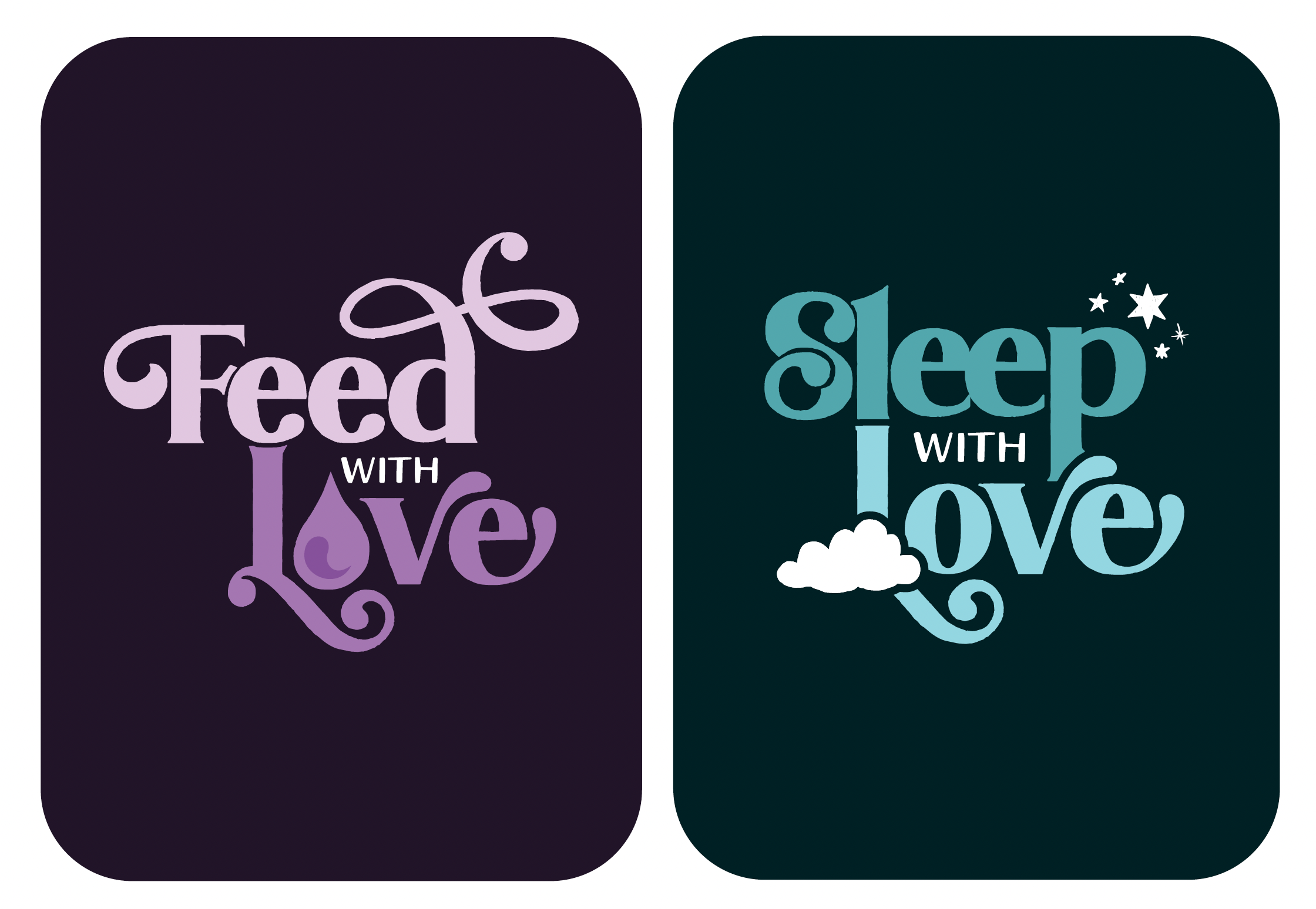
Her existing brand wasn’t serving her goals, and she wanted a system that was accessible, easy to read, memorable, and flexible enough to support future growth. We redesigned the logo, typography, and color palette to better align with her voice, creating a cohesive visual system that could support both areas of her practice.
Our client wanted a website that was both visually engaging and content-rich. We began with a competitive analysis of local lactation specialists and national organizations to understand the landscape and identify opportunities to clarify her positioning.
From there, we helped define a clear niche—one that felt supportive, informative, and transparent about what it’s like to work with a lactation and sleep coach. The content needed to speak to two primary audiences: expectant parents, who are often anxious and seeking reassurance, and new parents, who are frequently exhausted and overwhelmed. Information needed to be easy to find, easy to understand, and immediately comforting.
As we developed the copy, we focused on reflecting our client’s voice while distilling key talking points into clear, approachable language. During review, she shared that the messaging felt so aligned that she planned to incorporate it directly into her personalized sales conversations.

Within the unified site, each service was given its own emotional tone. Feed with Love was designed to feel bright and hopeful, while Sleep with Love guided visitors through a calmer, more restful visual journey. This approach allowed each offering to maintain its own identity while still feeling part of a single, cohesive brand.
The final site was designed and built in Webflow with flexibility and scalability in mind, making it easy to evolve alongside her practice.

This project highlighted the importance of designing with empathy—both in visual identity and content strategy. By unifying the brand and website experience, we created a system that feels supportive, intuitive, and adaptable, while helping the client communicate her expertise with clarity and confidence.